Do Bold Colors and Patterns Create a More Unique and Memorable Guest Experience?
Do Bold Colors and Patterns Create a More Unique and Memorable Guest Experience?
Color weaves together ambiance, emotion, and experience. In furniture design, color choices tap into guests’ subconscious minds, influencing their moods, perceptions, and memory.
Traditionally, the palette of luxury hospitality spaces has leaned towards neutral, calming tones, reflecting a desire to create a serene sanctuary for travelers.
However, as the industry evolves, so do the tastes and preferences of its clientele. Designers are increasingly incorporating bold colors and patterns into high-end spaces, challenging the conventional paradigms of tranquility and uniformity. This shift is not arbitrary but rooted in a nuanced understanding of color psychology and its dynamic potential to craft unique and memorable guest experiences.
Here’s a look at the psychology behind different color palettes, shedding light on why neutral tones have dominated luxury spaces and the advantages and disadvantages of using vibrant hues and designs.
Color Psychology, Emotions, and Guest Experience
Color psychology studies how different hues affect mood, feelings, and behaviors. For example, neutral tones create a relaxing backdrop. Blues are celebrated for their calming effects, while oranges and reds can stimulate energy and excitement.
Custom hospitality furniture offers a unique opportunity to leverage color psychology to its fullest. By tailoring furniture’s color to the ambiance of a space, designers influence the guest’s emotional journey.
Cool Tones: Spaciousness, Serenity, and Sophistication
Cool hues, ranging from soothing blues and greens to sophisticated purples, create serene escapes. They are subconsciously linked to the natural world and reflect the essence of relaxation.
The psychological impact of cool tones includes enhancing concentration and mental clarity. This makes them an excellent choice for areas designated for work or contemplation, such as business centers or private nooks within a hotel.
Warm Tones: Warmth, Connection, and Luxury
Warm tones, ranging from rich reds to sunny yellows and earthy oranges, are universally associated with comfort and welcome. They can create inviting spaces that evoke coziness and security, making guests feel at home. In luxury hotel furniture, incorporating warm tones can add luxury and warmth.
Whether it’s a bespoke reception desk that greets guests with the glow of cherry wood or plush lounge chairs upholstered in rich, terracotta fabrics, warm tones can make a bold statement or serve as subtle accents that enrich the guest’s experience.
Well-placed warm tones stimulate social interaction and conversation, so they are often used in lobbies, lounges, and dining spaces. The psychological effect of these hues encourages guests to unwind and engage, fostering a sense of community and belonging.
Neutral Colors: A Timeless Canvas
Neutral colors are the foundation of a design scheme prioritizing tranquility and relaxation. They provide a backdrop that allows other elements of the room to take center stage.
Neutral colors enlarge spaces visually, making rooms feel more open and airy. They also contribute to a sense of cleanliness and order, which is always good in high-end hospitality settings.
The downside of a neutral palette is that it may not be memorable. Different spaces blend into a blur of soothing backgrounds.
The Bold and the Beautiful
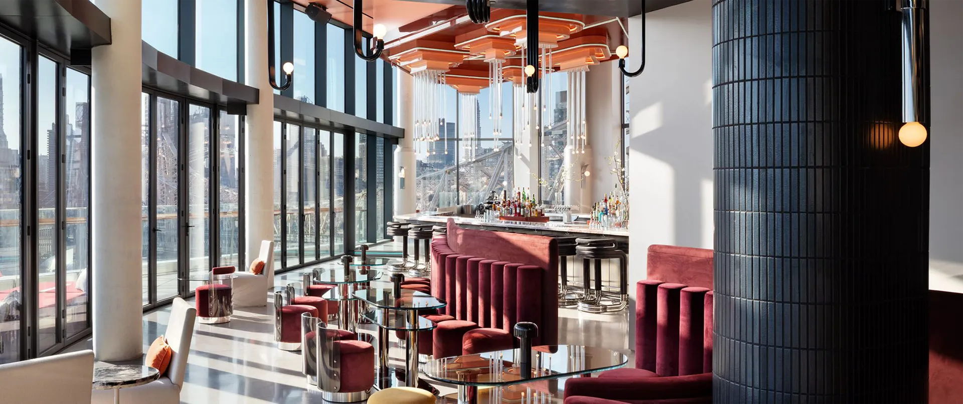
An emerging maximalism trend uses unconventional color choices, including rich purples, deep blues, and striking oranges. When used as accents or focal points, these colors make bold statements and carve out a unique visual identity for hotels while crafting an Instagram-worthy experience guests are eager to share.
Advantages of Bold Colors and Patterns
Bold colors and patterns are attention-grabbing. They naturally draw the eye and command attention. The vibrancy of the environment imprints itself on the visitor’s mind, setting the stage for a memorable experience.
Vibrant hues like reds and oranges can spark excitement, while intricate geometric patterns may stimulate the mind. Since memorable experiences are often emotionally charged, the strategic use of bold elements contributes to a lasting impression.
Bold design choices can make a space stand out. A hotel that dares to embrace distinctive colors and patterns can transform an ordinary stay into an extraordinary experience, etching itself into the memory of its guests.
Limitations of Bold Colors and Patterns
There’s a fine line between captivating and overwhelming. An excess of boldness can tip the scales towards sensory overload.
Personal tastes in color and pattern vary widely. What delights one guest might displease another, making universal appeal a challenging target for designs that lean heavily on bold choices.
Striking the Right Balance
Bold colors and patterns are not a one-size-fits-all solution. The decision to incorporate these elements should be guided by the hotel’s brand identity, target demographic, and the overall atmosphere it seeks to create. Hotels that emphasize individuality and character may find a natural ally in maximalism. The bold use of color and pattern offers guests an escape into a world of color and creativity that mirrors the uniqueness of their surroundings.
Creating Unforgettable Spaces
Subtlety and elegance often reign supreme in sophisticated venues. Yet, the strategic integration of vibrant, bold pieces can transform a space, infusing it with captivating energy and character. These carefully chosen accents act as focal points, elevating the hotel’s design narrative and imbuing it with personality.
Beyond their aesthetic appeal, bold elements make spaces photogenic. In an era where social media plays a pivotal role in shaping brand perceptions, visually striking details encourage guests to share their experiences with the world.
At Mittman, we build hospitality furniture that embodies the balance of luxury and vibrancy. Whether you’re looking to infuse your next project with the dynamic energy of bold colors and patterns or strike a subtle, harmonious balance with elegant, understated designs, our team is here to bring your vision to life. Connect with us today and get started.
